Motus
Creating a modern industrial brand around movement, reliability and more sustainable field operations.
Scope
Branding
Client
Motus
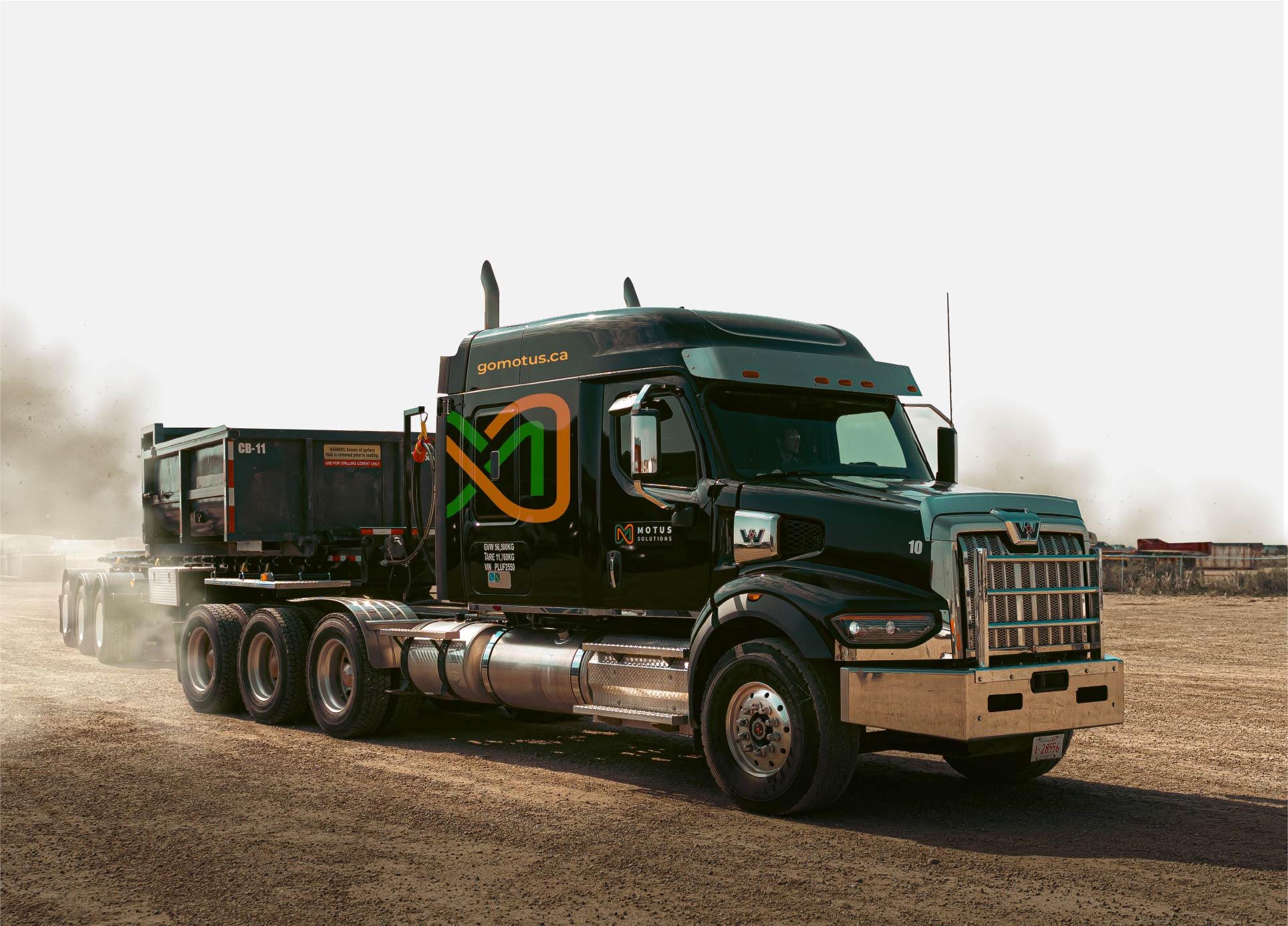
I developed the visual identity and broader design system for Motus Solutions, extending the brand across digital, social, marketing collateral, presentations, business communications and fleet applications.
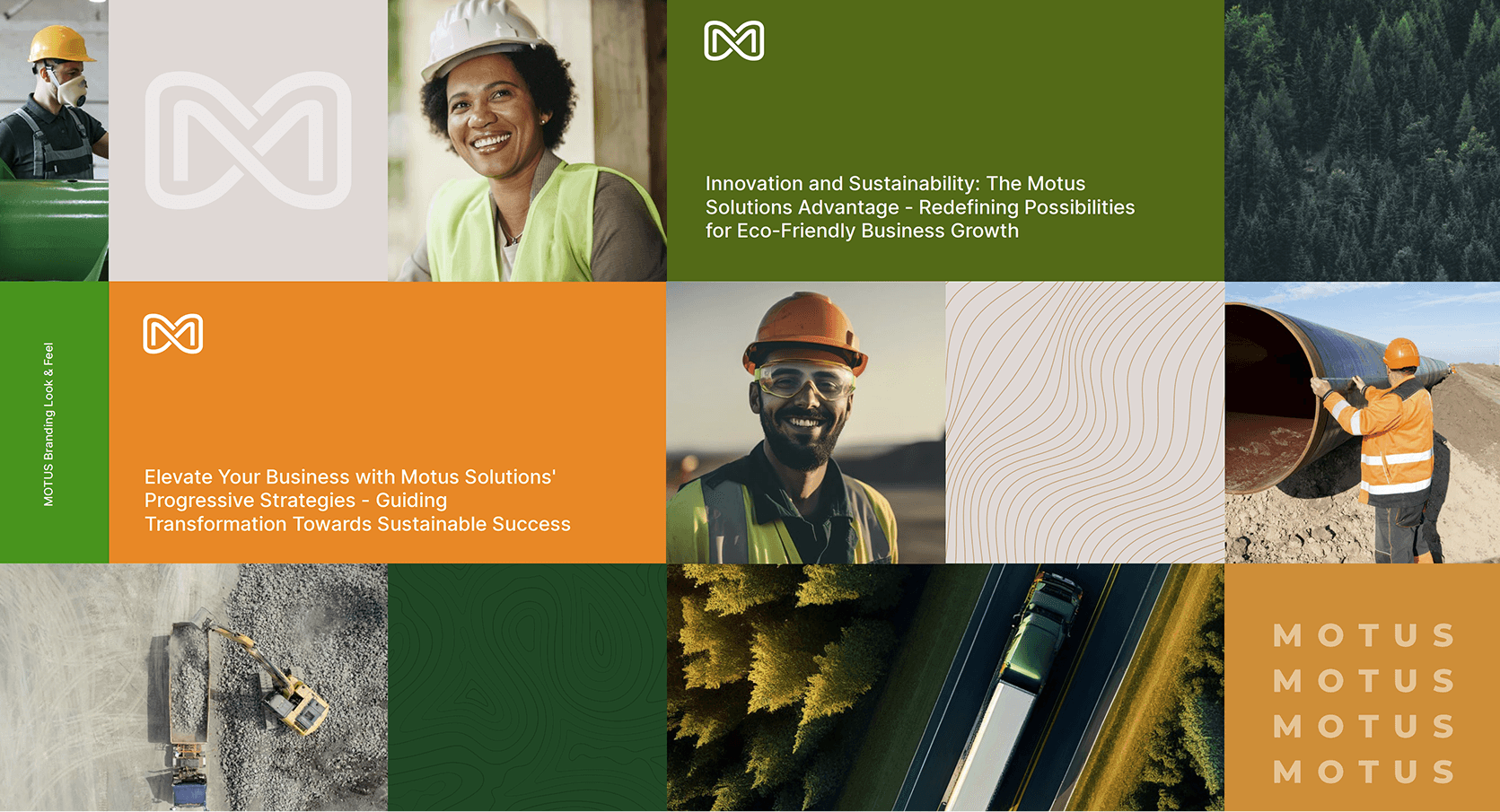
The system combines an expressive motion-inspired mark, deep forest greens, warm orange accents, natural photography and topographic graphics to create an identity that feels distinctly industrial while supporting the company’s sustainability positioning.
Challenge
Motus operates in an industrial environment where reliability, equipment capability and service execution need to feel immediate and credible.
At the same time, the brand needed to communicate a more progressive story around sustainable hauling, waste management and oilfield services without looking like a conventional environmental brand. The challenge was finding a visual language that could balance industry, movement and sustainability.
Contribution
I created a flexible identity system built around the Motus symbol, a forest-green and orange palette, strong typography, natural imagery and a topographic graphic language inspired by terrain and movement.
I then extended the system across social campaigns, brochures, newsletters, stationery, business communications, vehicle branding and the website — creating a consistent brand experience from corporate communications to real-world field applications.