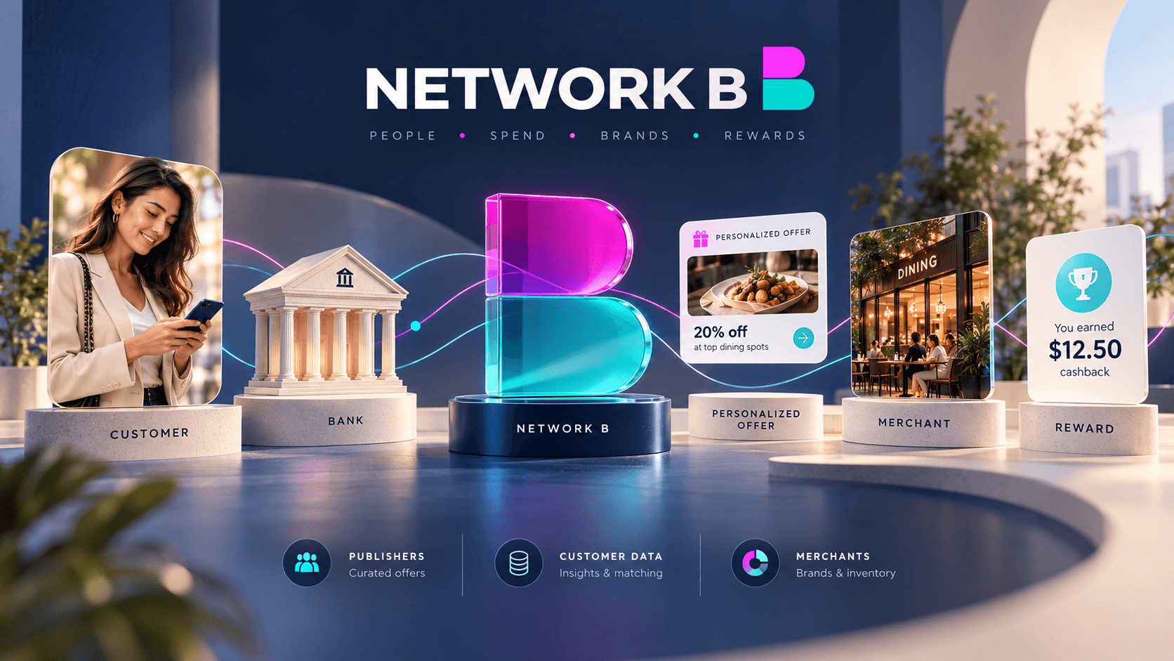
NetworkB
Translating a complex open-banking ecosystem into a clear, connected and distinctive brand experience.
Scope
Branding
Client
NetworkB
I developed the visual identity and broader design system for Network B, creating a cohesive brand capable of connecting financial technology, merchant intelligence, customer rewards and partner communications under one recognizable visual language.
The system combined a distinctive B monogram, deep navy, cyan and magenta palette, confident typography and modular graphic elements, giving the brand a contemporary fintech character while maintaining the credibility expected from a financial platform.
Challenge
Network B connected multiple audiences and technologies, customers, financial institutions, merchants and partners, making the proposition inherently complex.
The challenge was to create a visual identity that could make that ecosystem feel simple and intuitive while balancing the trust associated with financial technology with enough personality to differentiate the brand from conventional banking products.
The system also needed to remain flexible across very different touchpoints, from high-level brand storytelling to data-heavy merchant and partner communications.
Contribution
I created a scalable visual system spanning identity, typography, color, imagery, graphic language and digital applications, establishing a consistent foundation for the brand.
I extended that system across digital experiences, merchant intelligence dashboards, partner presentations, onboarding, reports, campaign assets and marketing communications, creating continuity between the corporate brand and the experiences surrounding the platform.
The result was a more unified and recognizable identity that made a complex financial ecosystem feel clearer, more approachable and more connected.