White Pony Express
Giving a community-led nonprofit a clearer, more human visual system for food rescue, programs and impact.
Scope
Branding
Client
White Pony Express
I developed and extended the visual system for White Pony Express across brand communications, program identities, campaigns, reports and digital applications.
The work needed to support a mission centered on connecting surplus resources with people in need, while creating enough structure for a growing network of programs and community initiatives. White Pony Express defines its mission around eliminating hunger and poverty by delivering available abundance to those who need it.
Challenge
White Pony Express had grown from a grassroots community effort into a substantial food and goods rescue organization, creating a much broader communications challenge.
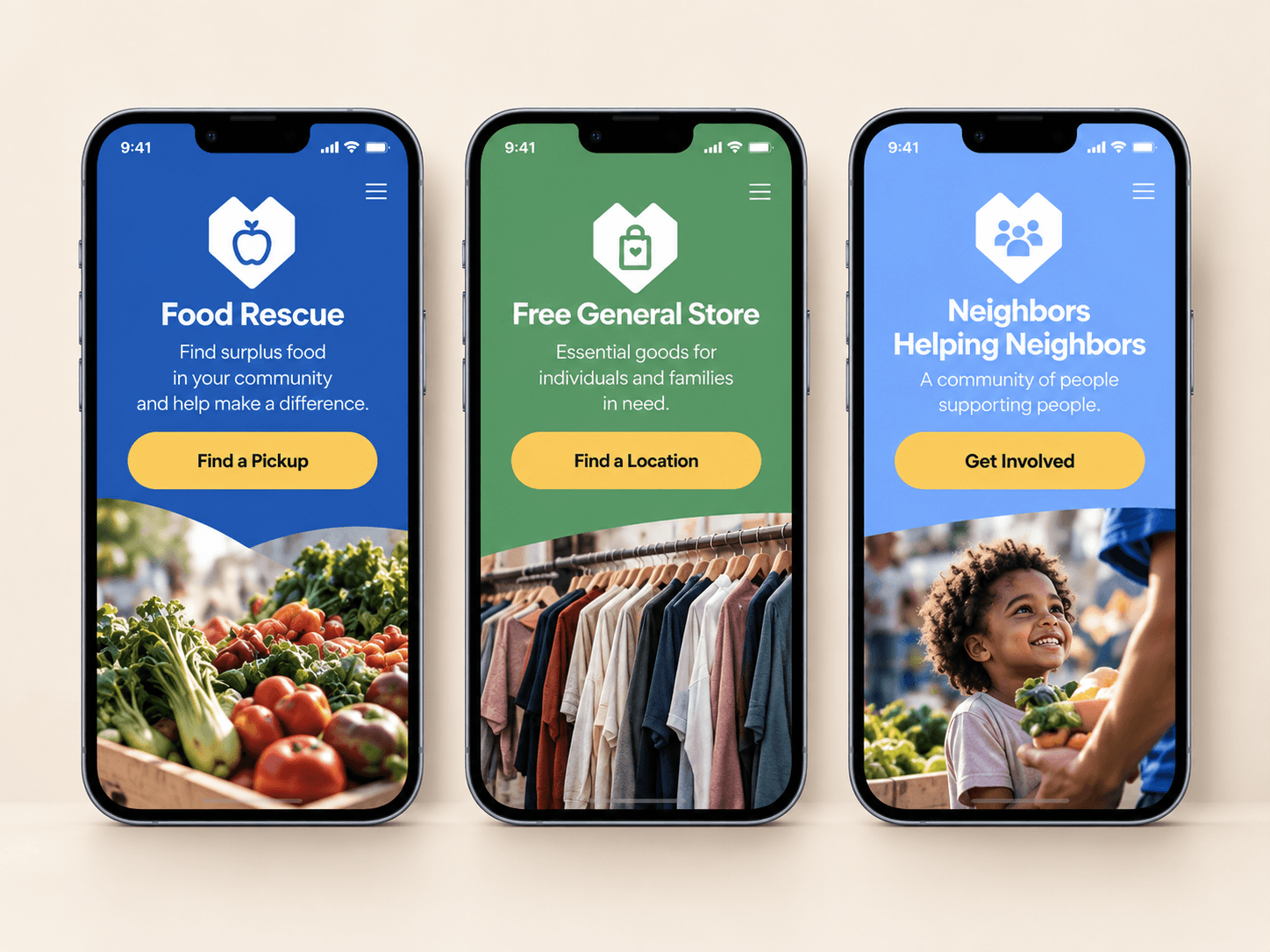
The brand needed to speak to donors, volunteers, community partners and recipients while making programs such as Food Rescue, General Store and Neighbors Helping Neighbors feel connected to one recognizable organization. White Pony Brand Guidelines
At the same time, the visual language needed to communicate measurable impact without losing the warmth and humanity at the center of the organization.
Contribution
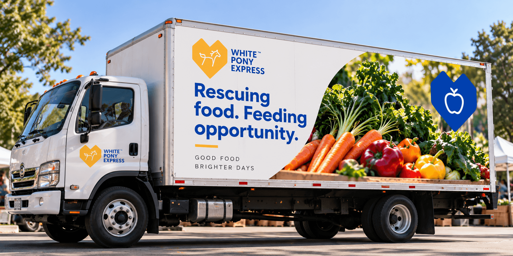
I created a flexible system that balanced bold typography, an optimistic blue-and-orange palette, documentary-style community photography and the recognizable heart-and-pony identity.
The system was extended across campaign creative, social content, program identities, impact reports, presentations and digital experiences, giving White Pony Express a more consistent way to communicate both its mission and its growing impact.
That impact story was already significant: the organization reported becoming one of California’s larger food-and-goods rescue delivery programs, addressing both surplus waste and community need.